Home Styling
The Essy’s Essentials Home Palette
A warm and timeless foundation of neutrals, natural materials and subtle metallic details.
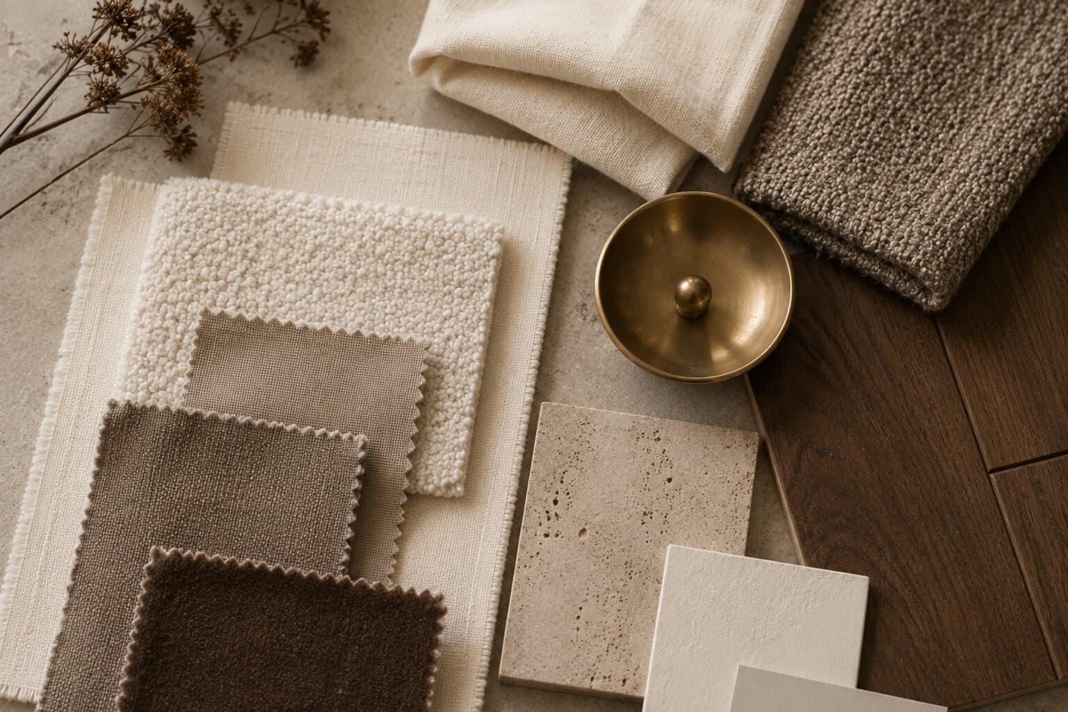
The Essy’s Essentials home palette is warm, layered and quietly European.
It does not rely on bright seasonal colours or short-lived interior trends. Its foundation is built from soft neutrals, rich brown tones, natural textures and restrained metallic finishes.
The palette should feel warm without becoming dark, elegant without feeling formal, layered without becoming busy, and seasonal without requiring constant replacement.
The Foundation Colours
Warm cream works for walls, curtains, larger textiles, ceramics and background surfaces. Choose cream with a soft beige or stone undertone rather than a cold blue-white - warm cream reflects light while remaining gentle.
Taupe brings depth to a neutral room through paint, upholstery, curtains, rugs, cushions and bedding. It may lean slightly grey, brown or mauve depending on the room; for the Essy’s Essentials look, prefer taupe with a warm brown base.
Beige and sand create softness between cream and deeper brown - use them for linen, wool, natural fibres, stoneware, lampshades and textured wall finishes. They work especially well when several shades are layered together.
The Grounding Colours
Walnut brown adds richness and structure through furniture, frames, shelving, bowls and trays, picture ledges and smaller decorative pieces. One or two strong walnut elements can ground an otherwise pale room.
Chocolate brown creates elegant contrast used selectively in leather, velvet, candles, cushions, artwork, book covers and small furniture. It should appear as a deep accent rather than cover every surface.
Muted olive connects warm neutrals with the natural world - use it for glass, ceramics, textiles, botanical artwork, plants and seasonal details. Choose olives that feel earthy rather than bright or yellow.
The Metallic Layer
Antique brass brings warmth without appearing overly polished - use it for lighting, picture frames, candleholders, hardware, mirrors and small trays. Avoid using too many different bright metallic finishes in one space.
Bronze is deeper and quieter than polished brass, working well in door handles, lamps, sculptural objects, bathroom details and smoked-glass combinations.
Aged gold may be used sparingly for frames, small decorative accents, vintage-inspired objects and tabletop details - the finish should feel softened rather than highly reflective.
The Material Palette
Warm wood - walnut, dark oak, medium oak or chestnut - should bring visible grain and warmth; a room may include more than one wood tone, provided the undertones are compatible.
Linen adds relaxed structure through curtains, tablecloths, cushions, bedding, napkins and lampshades - its natural creases support the lived-in quality of the interior. Wool provides softness and depth through rugs, blankets, cushions, upholstery and seasonal layers. Bouclé adds tactile interest to a restrained palette on an occasional chair, a bench or a cushion - balance it with smoother materials so the room doesn’t feel overly soft.
Smoked glass introduces depth without heavy visual weight in vases, lamps, glassware, cabinet doors and small bowls, and works especially well with walnut, bronze and warm stone. Ceramic and stoneware should have matte finishes, natural variation, soft irregularity, earthy glazing and warm white, taupe, olive or brown tones. Polished stone - travertine, warm marble, limestone or soft beige composite stone - adds quiet sophistication; avoid excessive pattern where the rest of the room is already detailed.
The Accent Colours
Seasonal accents should remain restrained, used in items that are easy to change - flowers, candles, books, napkins, cushions, small artwork and table settings.
The 60-30-10 Approach
A simple balance may be sixty percent foundation neutral, thirty percent grounding materials and secondary tones, and ten percent contrast, metallic or seasonal accent.
This is not a strict formula. It is a guide for preventing one element from overwhelming the room.
Palette Checklist
Before moving on to a room, confirm: a main neutral is selected, a supporting neutral is selected, a grounding wood tone is selected, a metallic finish is selected, one dark contrast is included, a natural texture is included, the seasonal accent is limited, and the colours repeat across the room.
Seasonal Accents
Spring
- Soft sage.
- Pale butter.
- Dusty blue.
- Fresh green.
Summer
- Sun-washed ochre.
- Terracotta.
- Faded coral.
- Olive.
Autumn
- Russet.
- Chestnut.
- Deep olive.
- Muted aubergine.
Winter
- Oxblood.
- Forest green.
- Tobacco.
- Deep plum.
Pair It With
- A Home That Feels Considered
- The Layered Lighting Guide
- Art, Mirrors and the Walls Between
- The Home Atmosphere Edit
A strong home palette is not a list of matching colours.
It is a relationship between warmth, depth, texture and light. When the foundation is coherent, seasonal details can change while the home itself continues to feel recognisably the same.

Written by Esther
Esther is a photographer and storyteller, and the founder of Essy's Essentials - a seasonal home for stories, rituals, recipes and everyday luxuries.
More about Esther →