Home & Living
Colour Drenching in Taupe: What Painting Our Walls, Ceilings and Doors Taught Me
An honest look at using one warm neutral, Flexa Urban Taupe, across a new-build home, with a deeper Bakery Brown staircase and the practical things I would test before painting yours.
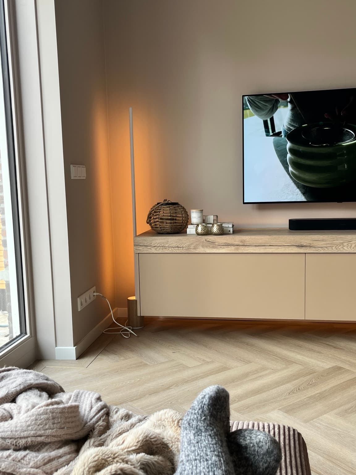
The appearance of taupe changes considerably between daylight and evening lighting.
What colour drenching means
Colour drenching means carrying the same paint colour across several surfaces, usually walls, ceiling and woodwork, instead of breaking the room up with white edges. In our new-build home we chose Flexa Urban Taupe for much of the walls, ceilings and doors, then used the deeper Flexa Bakery Brown on the staircases: an enveloping foundation with one deliberate tonal contrast, not one shade on absolutely everything.
I didn’t want our new-build house to look like a show home.
And I certainly didn’t want to live in a collection of white boxes while we gradually decided which colours we were brave enough to use.
I wanted the house to feel finished, warm and quietly connected from one space to the next. A home where you could open a door and the next room would still belong to the same story.
That is why we decided to paint far more than the usual four walls. Walls, ceilings and doors became part of one colour plan, with warm taupe running throughout much of the house. Even small details, such as the ventilation outlets that might otherwise have remained visually obvious on the ceiling, were considered as part of the overall finish, with suitable professional preparation and care for their function.
This wasn’t about following an interiors trend. It was about making a newly built house feel like somewhere we already belonged.
Now that we live with the result, I can explain what I love about it, what requires more thought than Instagram suggests, and the choices I would encourage you to test before picking up a paintbrush.
Colour drenching in a nutshell
The short version, before the detail.
| My answer | |
|---|---|
| What is colour drenching? | Painting walls, ceiling and often doors, skirting and other woodwork in one colour or closely related tones |
| Does it have to be dark? | No. Warm taupe, beige, stone and other mid-tone shades can work beautifully |
| What did we use? | Flexa Urban Taupe across much of our home, with Flexa Bakery Brown staircases |
| Why did we choose it? | To reduce visual breaks and give the new-build house a warmer, more continuous feel |
| Do all surfaces need the same paint finish? | Not necessarily. The colour can match while the coating is chosen for each material and level of wear |
| My biggest recommendation | Test the colour on several surfaces in both daylight and evening lighting before committing |
What is colour drenching, exactly?
Traditionally, many homes have white ceilings, white skirting boards, white door frames and sometimes white doors, even when the walls are painted in a different colour. There’s nothing inherently wrong with that. In the right room it can look crisp and beautiful.
Colour drenching makes a different choice: it reduces those contrasting borders so the colour wraps around the space. Interior paint brands such as Dulux and Little Greene describe the technique as continuing one shade, or closely related tones, over walls, ceiling and architectural woodwork.
The immediate effect isn’t magic. It is visual continuity. Your eye is less likely to stop at a bright horizontal line where the wall meets the ceiling, or at a white rectangle around every door.
For me, that sense of continuity was particularly appealing in a new build. The architecture was very clean, so small breaks and contrasts had a surprisingly strong effect.
But I would make one distinction: true single-colour drenching means the same shade across the chosen surfaces. Tonal drenching allows related shades with different depth. We use both ideas in our house. Urban Taupe provides the main enveloping colour; the deeper Bakery Brown staircases intentionally stand apart within the same warm family.
That is not a contradiction. It is the point.
Dulux: how to colour drench a living room →
Little Greene: embracing colour drenching →
Why we chose warm taupe instead of white
I love a beautiful white interior in photographs. I also knew I didn’t want it for our everyday home.
Our style has always leaned towards warm neutrals, wood, brass and bronze details, quiet lighting and plenty of texture. We have a herringbone floor and the sort of repeated finishes that can make an entire house feel considered when they are allowed to work together.
So the paint needed to be the backdrop, not the main event.
Flexa Urban Taupe gave us a warm foundation that could connect the rooms. It sits comfortably with our wooden surfaces and metal details without demanding that every cushion, lamp and piece of furniture match it precisely.
That was important to me. I wanted to be able to change the room throughout the year, with darker, richer accessories in autumn and lighter flowers and textiles in spring, without repainting the architectural shell.
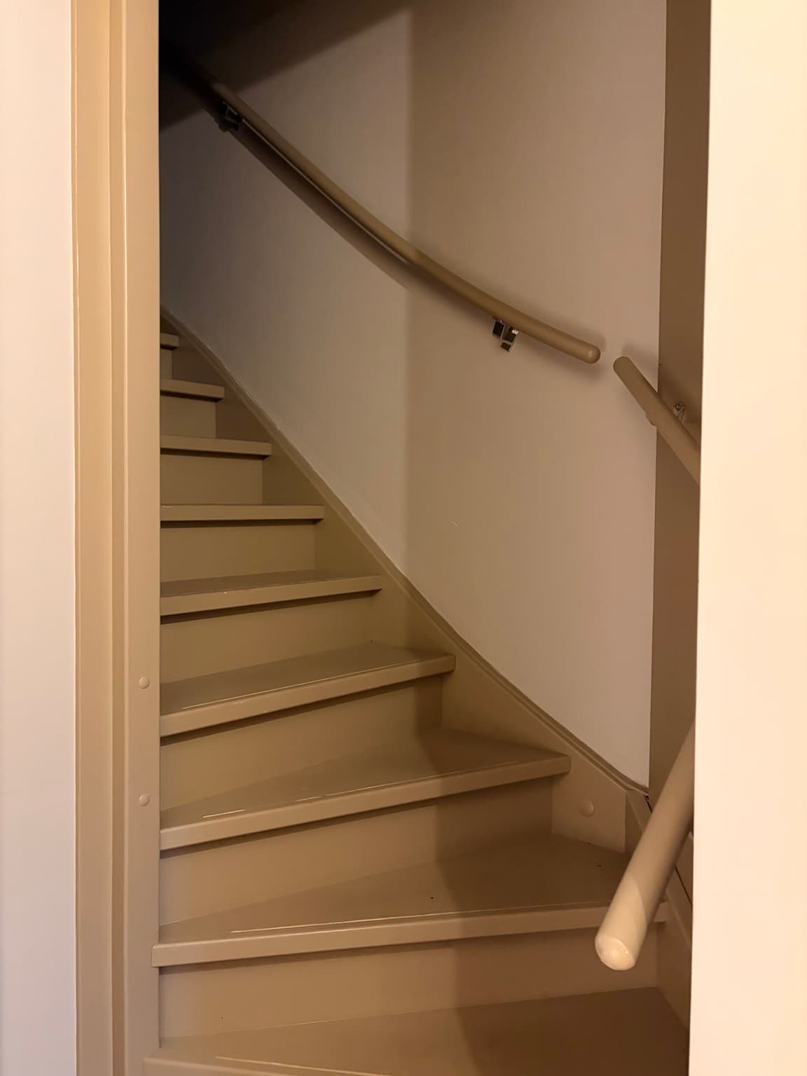
We paired Urban Taupe with Flexa Bakery Brown on the staircases upstairs and downstairs. The contrast adds depth and gives the stairs their own presence without feeling like they belong to an entirely different house.
This is exactly what I mean by colour as a system. Rather than choosing attractive swatches one at a time, we thought about how they would look next to the floor, the doors, the lighting and the adjacent rooms.
The result in our home: an enveloping, soft background with a few carefully chosen deeper accents. I would make the same broad colour decision again.
Walls, ceilings and doors: why the whole combination matters
Painting the walls taupe while leaving everything else stark white would have given us a very different effect. I wanted the ceiling to feel connected to the walls and the doors to belong to the room rather than appearing as separate white panels.
Walls: the largest colour surface. Walls are where most people begin, but I wouldn’t choose the final colour from a tiny swatch held in front of a bright shop display. It deserves to be seen in the actual room. Large surfaces reveal undertones. A taupe that looks cosy in one photograph can appear greyer, pinker or more brown when it sits beside your own floor or is exposed to a different direction of daylight.
Ceiling: the part people are often afraid to paint. A white ceiling is familiar. Choosing the same hue as the walls can feel like a much bigger commitment than it actually is, partly because we’re so accustomed to white as the default. For us, carrying Urban Taupe upwards helped the rooms feel connected. I like the absence of a sharp white line across the top of the walls. Will doing this make every ceiling look higher? No. That depends on proportion, colour, light and where your eye is drawn. Some rooms will feel more cocooning rather than taller, and that can be exactly what you want.
Doors and woodwork: where the practical choices begin. Doors, skirting boards, frames and other joinery are not simply miniature walls. They are touched, bumped and cleaned differently. You can choose the same colour without using the same paint product. Ask your decorator or paint supplier for an appropriate system for each substrate: wall emulsion for suitable walls, and a suitable trim coating for prepared woodwork or factory-finished doors, for example.
A durable finish on a frequently used door might reflect light differently from a matt wall, even when the colour name is identical. That isn’t necessarily an error. The subtle difference in sheen can give the space a little depth.
Our home was professionally painted. I wouldn’t pretend that a whole-house job, including the staircases, is a casual weekend DIY project.
Does colour drenching in taupe make a room too dark?
This is one of the first concerns people raise, and I think it’s a sensible one.
There is no universal answer, because taupe is not one fixed lightness or undertone. A pale, warm greige and a deep brownish taupe may both carry that name while behaving very differently.
The room matters just as much. So do window size, orientation, adjacent buildings, floor colour, furniture and artificial lighting.
In our home, the warmth is part of the atmosphere I wanted. But I wouldn’t tell someone with a small, north-facing room to copy our paint choice without testing it there first.
What works for us is a relationship between the surfaces: warm paint, a continuous herringbone floor, carefully chosen metal details and layered lighting. That’s a combination, not a colour code that guarantees a result.
Five things to test before deciding:
- Morning daylight: look at the sample when the room receives its earliest natural light.
- Afternoon light: notice whether the paint becomes warmer, greyer or more muted.
- Evening lamps: view it under the bulbs you actually use, particularly warm lamps or tunable Philips Hue lighting.
- Next to fixed materials: hold the sample beside the floor, kitchen cabinetry, door hardware and large pieces of furniture.
- Across different planes: place or paint samples on both a wall and a ceiling-facing surface, and check a suitable trim sample too if doors are included.
I would take photographs as a reminder, but I would make the final decision in person. Phone cameras, editing and screen brightness can change the way taupe looks.
How I would choose a taupe paint colour now
I would start with the things that are expensive or difficult to change. Not a cushion. Not a candle. The floor. The kitchen. The larger furniture. The direction of the light. The metal finishes repeated around the house. Then I’d narrow the paint options to a small number of shades that work with those fixed elements.
Look for undertones before choosing depth. Some taupes lean mauve, others more grey, olive or brown. If the rest of your home is warm and earthy, a very cool taupe might make the whole scheme feel less connected than you’d expected.
Test a meaningful area. Tiny cards are useful for eliminating obvious wrong choices, but not for understanding an entire room. Use a substantial sample area or a large movable sample panel as recommended by the paint supplier, and examine it in the actual light.
Make a finish schedule. List each surface and material: plaster walls, ceiling, doors, skirting boards, stair treads, bannisters and any specialist surfaces. Confirm preparation, primer where necessary and the right coating for each. The same colour across different products may have slight differences in sheen or appearance.
Decide where the colour stops. Your home doesn’t need to be painted identically from front door to loft. A bedroom or small study may have a different feeling. What matters is that transitions look intentional rather than accidental.
Check the whole-house view. Stand where you can see from one room into another. If two spaces share a long sightline, ask how they work together rather than making each room an isolated colour scheme.
The Bakery Brown staircase: why I didn’t paint absolutely everything taupe
The staircase is one of my favourite examples of choosing coherence without sacrificing contrast.
We had both staircases professionally painted in Flexa Bakery Brown, which is deeper than Urban Taupe but belongs to a similarly warm family of tones.
It gives the stairs an architectural role. They’re not just a pale connecting space that disappears, but neither do they feel disconnected from the rooms around them.
In an all-neutral home, different depths can be as useful as different colours. A rich brown staircase against warmer taupe surroundings has more presence than an entirely identical scheme, while still looking deliberate.
The work itself wasn’t trivial, which is why I wouldn’t recommend treating staircase painting like a casual experiment. Preparation, access, curing time, the correct slip-resistant or suitable floor/stair coating where relevant, and daily use all need proper consideration with your painter.
The question I would ask isn’t, “Should every single part of my home be the same colour?” It’s, “Where will a deeper shade improve the relationship between the spaces?”
How warm lighting changes a taupe room
This is where a beautiful colour scheme can go wrong on paper.
A paint sample chosen in bright daylight may behave differently under warm evening lighting. Two walls in the same room may appear to be different colours because one receives more natural light and another is lit by a wall lamp.
We use Philips Hue in our home and have thought carefully about layered lighting. That gives us flexibility, but it also means you shouldn’t judge a paint colour under a single exaggerated warm scene and assume it will look identical at every time of day.
For a truly useful comparison, test the room at the lighting levels and colour temperatures you actually enjoy living with. And remember that Kelvin describes the light’s colour appearance, not its brightness. The lighting in a photo or online render can be a poor guide to what your taupe will look like on your walls.
If you’ve already read our Layered Lighting Guide, the principle is the same: the paint and the lighting should be planned as one atmosphere, not two unrelated purchases. For the colour-temperature side, see 2700K vs 3000K lighting.
Brass, bronze and wood: what goes with taupe walls?
What I love about warm taupe is that it doesn’t force you into a purely beige room.
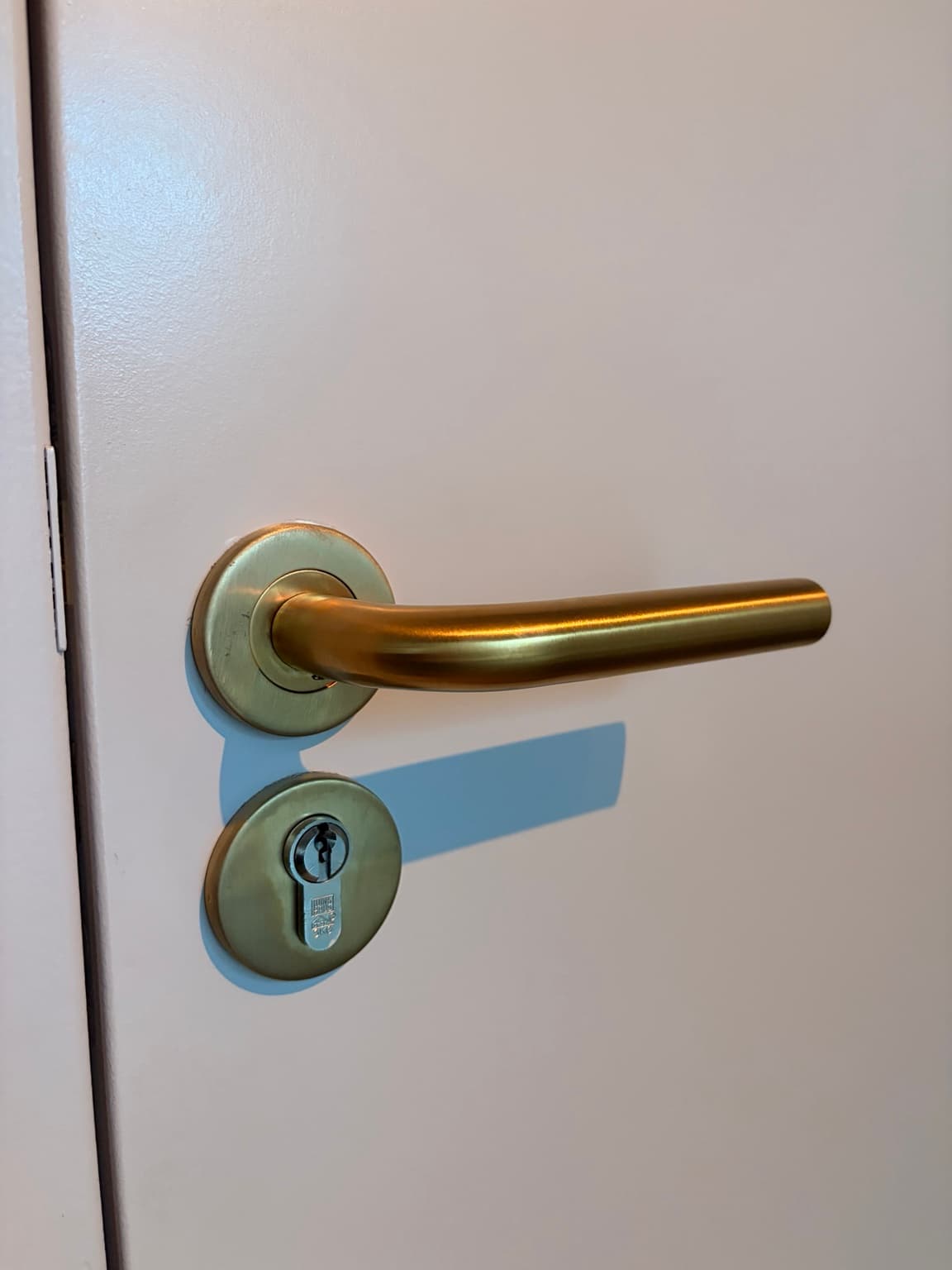
Our interior includes warm wood, a herringbone floor and bronze or brass details. Those materials add contrast through texture and finish, rather than relying on a different bright colour on every surface.
I particularly like the way the metal details catch warm light in the evening. It introduces a small bit of polish without making the house feel formal.
There is also a practical advantage to choosing a cohesive foundation: I can move small objects between rooms and they usually feel at home. Books, trays, lamps and seasonal textiles don’t have to be purchased again for every different space.
For the full palette behind the house, see The Essy’s Essentials Home Palette. That article explains the supporting tones, materials and metallic finishes; this one focuses specifically on the painting decisions and how to test them.
A detail most colour-drenching guides overlook: the things attached to the ceiling
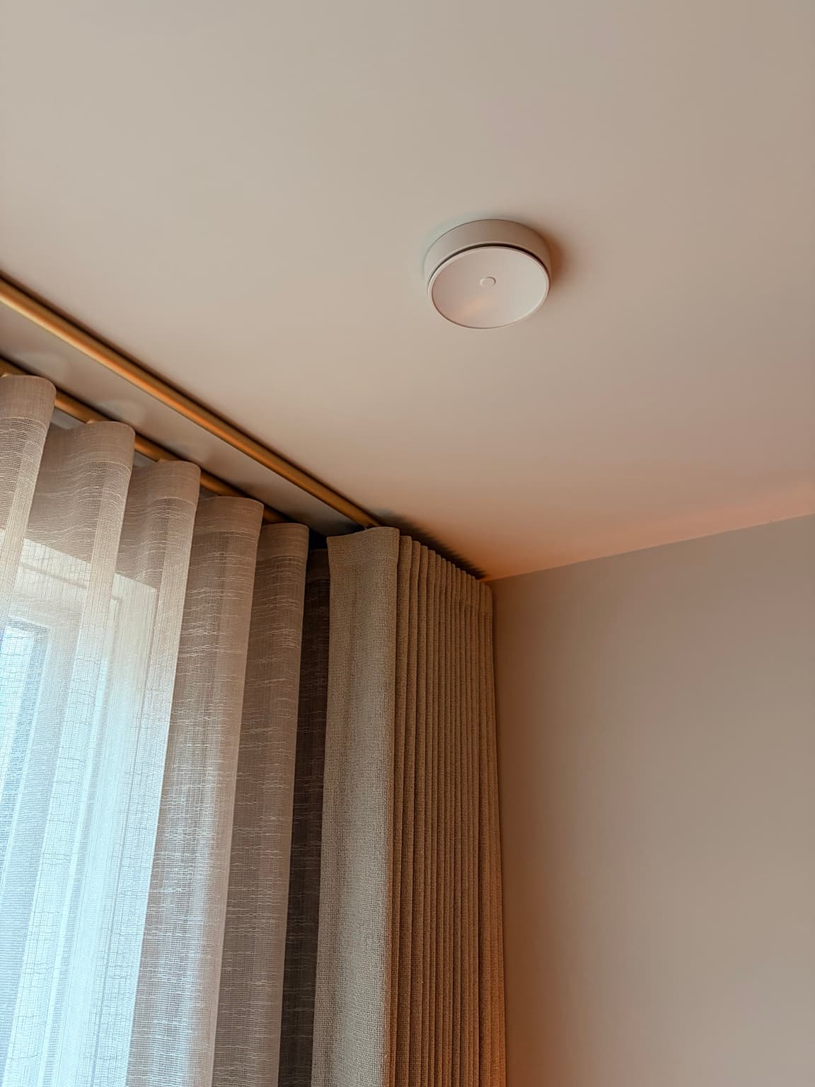
When you paint a ceiling to match the walls, a standard white vent or fitting may suddenly become much more noticeable.
We noticed this in our new-build home. Some ventilation outlets, necessary for the central ventilation system, visually interrupted the ceiling. I asked our painter whether they could be colour matched while remaining suitable and functional.
It was more involved than simply painting over an installed outlet. Appropriate professional preparation and a suitable finish were part of the process.
Do not paint ventilation components, sensors, smoke alarms, sprinklers or other functional fittings without checking the manufacturer’s instructions and getting qualified advice. Their performance, detection capability, airflow or maintenance access must never be compromised for the sake of a matching ceiling.
I include this because colour drenching isn’t only about choosing an attractive paint shade. It’s also about noticing which fixed details will stand out once that shade covers the room. The best result is the one you can live with safely and maintain properly.
What colour drenching won’t solve
Paint is wonderful, but it can’t correct every design issue.
It won’t make poorly planned lighting disappear. It won’t make uncomfortable furniture comfortable. It won’t make incompatible materials suddenly match. And it won’t automatically turn a small room into a large one.
It can, however, soften visual transitions and create a sense of deliberate cohesion. The effect is strongest when it’s part of a broader plan for light, texture, floor finishes, doors and hardware.
That’s why I would advise anyone renovating or building a home to consider the colour plan before deciding on every finish independently. The room may look different when you stop treating the ceiling, doors and walls as separate colour decisions.
Is colour drenching more expensive than traditional painting?
It can be, especially if it means painting many more surfaces, preparing doors or staircases or using specialist products for woodwork.
But there is no honest universal price difference. It depends on the condition of the surfaces, the paint system, the number of coats, labour rates and how much work you would have commissioned anyway.
If you’re requesting quotes, ask the painter to itemise walls, ceilings, woodwork, preparation and any specialist details separately. That makes it easier to decide where the cohesive effect is worth the additional work for you.
For us, the investment in the colour scheme was about living with it every day, not creating a photographic before-and-after moment.
Would I choose Urban Taupe again?
Yes, as the warm foundation of our home.
It gave us the calm, connected feeling I wanted, particularly combined with the deeper stair colour and the materials we’d already chosen.
But that isn’t the same as saying Urban Taupe is the ideal shade for every house. A colour is only ever as successful as its relationship with the light, the adjacent materials and the people living there.
If I were starting again, I would still spend time testing it in the actual rooms. I would still choose appropriate finishes for each surface. And I would still think about sightlines, handles, ventilation outlets and lighting before calling the painting plan complete.
The approach is worth repeating. Blindly copying a colour code isn’t.
About this article
Written from our own new-build home in the Netherlands. Colour choices and personal impressions are first-hand; technical painting and ventilation decisions must follow the relevant product instructions and qualified professional advice. This is an independently written home story, not a sponsored paint review, and it carries no affiliate links. For the broader story of our decisions, read The Small New-Build Decisions Behind Our Actual Home.
The Essy’s verdict
Our house doesn’t feel finished because every wall is dramatic or every item has been carefully styled for a photograph.
It feels finished because the surfaces speak to one another.
The warm taupe, the deeper stairs, the continuing floor, the lighting and the metal details are all part of the same decision: to make an ordinary evening at home feel rather lovely.
Would I encourage you to try colour drenching? Yes, but I’d encourage you to test the colour, plan the finishes and think about the entire room before committing.
Because the best part isn’t the trend. It’s walking into a home that feels genuinely yours.
More From Our New-Build Home
Frequently asked questions about colour drenching
What is colour drenching?
Colour drenching is a decorating technique where the same colour, or closely related tones, continues across walls, ceiling and often doors, skirting boards and other woodwork to create a more unified space.
Can you colour drench with taupe?
Absolutely. Taupe is particularly useful if you want a calm, warm result rather than a bold saturated colour. Test the shade in your own natural and artificial light, because undertones vary widely.
Should ceilings be the same colour as the walls?
They can be, if you want a continuous, enveloping effect. There is no rule that ceilings must be white. Whether the result feels cosy, dramatic or airy depends on the shade, room and light.
Do the doors need to be exactly the same colour?
Not necessarily, although matching them can strengthen the effect. Our approach uses Urban Taupe across many of the main architectural surfaces and a related deeper shade on the staircases. Matching colour does not mean every surface should use the same type of paint.
Does colour drenching make small rooms look smaller?
Not automatically. Removing high-contrast borders can make a room feel more continuous, while darker shades can make it feel cocooning. Test the effect in your particular room rather than relying on a universal promise.
Can I use the same matt paint on walls and doors?
Do not assume so. Doors and other woodwork may need different preparation and more durable, substrate-compatible paint. Ask your decorator or paint manufacturer for an appropriate system.
Is colour drenching suitable for a new-build home?
Yes. We used it to connect the architectural surfaces in our own new-build house. However, newly finished walls, doors and other materials may need the right preparation and drying or curing times; follow the builder’s and paint manufacturer’s instructions.
What colours work with taupe walls?
Warm woods, cream, walnut, dark brown, bronze, brass and restrained olive can all work, depending on the exact undertone. In our home, Bakery Brown staircases and warm metal details add depth to Urban Taupe.
How do I test a taupe colour properly?
Use a large sample in your actual room, look at it in morning, afternoon and evening light, compare it against flooring and fixed materials, and check how the proposed finish behaves on different surfaces.
Is colour drenching the same as tonal drenching?
They overlap, but a strict single-colour scheme uses one shade across surfaces, while a tonal approach combines related shades of different depths. Our Urban Taupe foundation and Bakery Brown staircases illustrate how both ideas can work together.

Written by Esther
Esther is a photographer and storyteller, and the founder of Essy's Essentials - a seasonal home for stories, rituals, recipes and everyday luxuries.
More about Esther →