Home & Living
2700K vs 3000K: Which Lighting Is Best for Your Home?
2700K or 3000K? A calm guide to warm-white colour temperature by room, Kelvin versus lumens and CRI, warm neutral paint, and what Philips Hue White and White Ambiance can and cannot do.
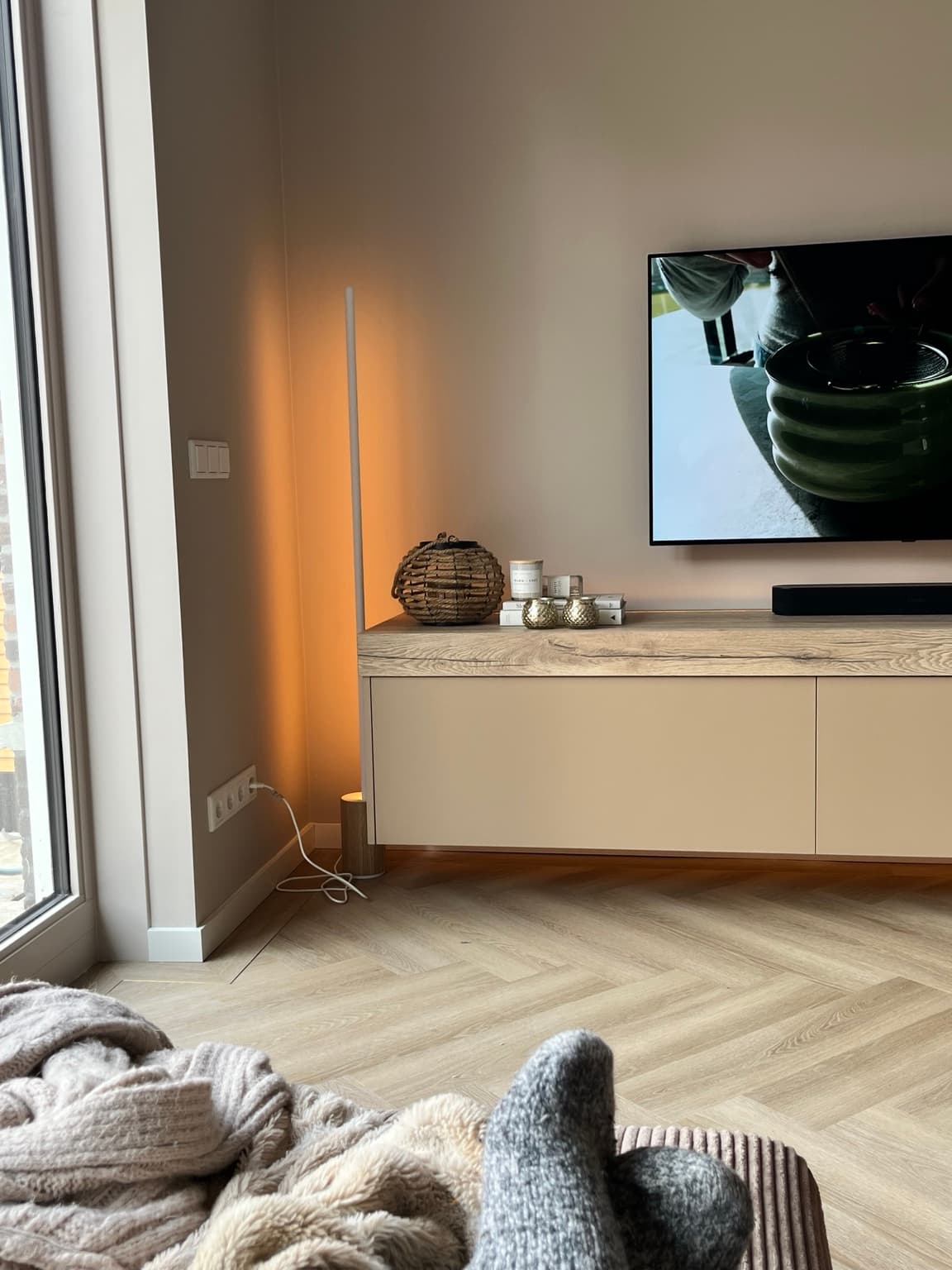
The short answer
2700K is a warmer, more golden-looking white; 3000K is a slightly cleaner, less yellow warm white. Both fall within the warm-white range, so 3000K is not the same thing as stark blue daylight lighting.
Both are called warm white. Both can look lovely. But 2700K and 3000K can make the same room feel surprisingly different — especially when you have warm walls, natural wood and soft furnishings that deserve to look as beautiful after dark as they do in daylight.
One of the things we thought about carefully when planning our new-build home was lighting.
Not simply where a beautiful pendant would go, but what we would actually need the lights to do. I wanted a home that could feel bright and practical when we were cleaning, soft and cosy in the evening, and comfortable when we walked through the hallway at night.
We use Philips Hue extensively, together with functional lights and lighting that changes according to the moment. And while I love a good smart-home function, I’ve learnt that the smartest system in the world is not much use if the light itself feels wrong in the room.
That’s where the seemingly tiny difference between 2700 Kelvin and 3000 Kelvin becomes interesting.
If you’re choosing bulbs for a living room, bedroom, kitchen or a newly renovated home, here’s what the numbers actually mean — and how I would decide between them.
2700K vs 3000K at a glance
For evening living rooms and bedrooms, I’d usually start by testing 2700K. For kitchens, bathrooms, dressing spaces or areas where you need to see detail, 3000K can be a useful starting point. Neither is automatically better: the right choice depends on the activity, brightness, lampshade, wall colour and the quality of the specific bulb.
These are descriptions and starting points, not measurements of your own room.
| 2700K | 3000K | |
|---|---|---|
| Colour appearance | Warm, golden white | Warm white, a little cleaner or less amber |
| Typical first place to test | Cosy living room, bedroom, evening lamps | Kitchen, bathroom, dining/work areas |
| On warm neutral walls | Can emphasise golden, beige tones | Can keep warm neutrals looking slightly more balanced |
| Is it bright? | Kelvin does not tell you | Kelvin does not tell you |
| Does it work with smart lighting? | Yes, if supported by the bulb | Yes, if supported by the bulb |
| Is one always better? | No | No |
What Does Kelvin Actually Mean in Lighting?
Kelvin, usually shortened to K, describes the correlated colour temperature of a white light source. On the familiar lighting scale, lower numbers look warmer or more amber; higher numbers generally look whiter and eventually cooler or bluer.
It is slightly counterintuitive. A lower Kelvin number is visually warmer.
For a quick reference:
- 2200K: very warm, amber-like light, useful for certain evening scenes.
- 2700K: the familiar warm white associated with many traditional home bulbs.
- 3000K: warm white with a somewhat cleaner, less yellow impression.
- 4000K: a more neutral-to-cooler white commonly considered for functional lighting.
- 5000K and above: daylight-like white, which may feel more clinical in certain domestic settings.
The actual appearance can differ between manufacturers and lamp designs. A translucent shade, a tinted bulb, a coloured wall and daylight entering the room can all change what your eyes perceive.
So the Kelvin number is useful, but it cannot make an entire decorating decision for you.
Does 3000K Look Too White or Cold?
Usually, no. It is still classified as warm white.
In a room that has only ever used very golden lamps, switching to 3000K can initially seem brighter or whiter. That doesn’t necessarily mean it is harsh. It may simply be a noticeable change in colour appearance.
The bigger jump is often between 2700K and a cooler option such as 4000K.
It’s worth testing the bulbs in the actual room at the time you normally use them, rather than judging them side by side under bright shop lighting.
When you’re choosing between 2700K and 3000K, subtlety matters.
Kelvin Is Not Brightness: Understand Lumens Too
This is probably the most important practical distinction.
Kelvin describes the colour appearance of the light. Lumens describe the amount of light produced. Watts describe electrical power consumption, not simply how bright a modern LED bulb will be.
You can buy a relatively bright 2700K bulb or a much dimmer 3000K bulb. If one feels more comfortable than the other, brightness may be part of the reason — not just colour temperature.
That means a proper comparison should use two bulbs with similar lumen output and similar fittings, preferably from the same product family. Otherwise, you are comparing several variables at once.
And if you’re using dimmable lighting, assess both bulbs at the brightness level you actually like in the evening.
What is CRI, and why should you care?
CRI stands for Colour Rendering Index. It describes how a light source renders colours compared with a reference light source of similar colour temperature. It is a separate characteristic from Kelvin.
If the colours of your walls, wood or artwork matter to you, the colour-rendering quality of the bulb deserves attention alongside its colour temperature. A higher-quality light source can make materials look more natural, but a high number does not solve every issue with the light’s spectrum or design.
Before buying large numbers of bulbs for an interior, I would check the manufacturer’s specifications and test one in the room.
2700K or 3000K for a Living Room?
For an evening-focused living room, 2700K is a sensible starting point. It can make warm wood, soft textiles and an inviting sofa corner feel comfortable without requiring a very bright overhead light.
But I wouldn’t insist on a single Kelvin setting for every function in the room.
If you read beside the sofa, you may want a more focused lamp. If you need a brighter setting for finding things, cleaning or working on a project, you may choose a different brightness or white temperature for that moment.
Our home is designed around several layers of light rather than one ceiling lamp trying to do everything. That practical approach is the foundation of my Layered Lighting Guide.
The simple principle is this: test the light where you sit, not only where the bulb is installed.
2700K or 3000K for a Bedroom?
In a bedroom, my preference would usually be to begin with 2700K for bedside and evening ambient lamps, especially if the room is decorated in soft neutrals and used for reading or winding down.
That doesn’t mean the wardrobe, dressing area or bathroom lighting has to match the bedside lamp. Those tasks may benefit from lighting that lets you see colours and details more clearly.
The important thing is to avoid turning the bedroom into a collection of unrelated white tones. If a ceiling lamp is much cooler and brighter than the bedside lamps, the room can feel inconsistent when everything is switched on together.
Try using the brighter light for practical tasks, then switching to the gentler lamps later. If you are also rethinking the bed itself, how to make your bed feel like a luxury hotel is the companion guide.
A warm evening is created by both the colour and the level of light. Simply choosing 2700K won’t help if the bulb is far brighter than the space needs.
2700K or 3000K for a Kitchen?
This is where I would be particularly open to 3000K.
A kitchen has two very different jobs. It needs clear, useful lighting when you’re chopping, cooking and cleaning, but it can also be part of an evening atmosphere when the work is done.
A well-positioned 3000K task light may look a little cleaner over a worktop. That doesn’t mean you need to flood the entire kitchen with the same light after dinner.
If you have under-cabinet lighting or a dimmable pendant, consider how the different layers work together. A brighter practical layer during food preparation and a softer setting for the evening can serve both purposes.
We thought about different behaviours for our kitchen lighting when planning the new build, because the room needs to adapt throughout the day. That matters more to me than picking one supposedly perfect bulb for every hour.
When working with electrical fittings, fixed installations or wet areas, follow local electrical regulations and use a qualified installer where appropriate.
And What About Bathrooms, Hallways and Home Offices?
A quick room-by-room guide:
These are not engineering specifications. They are first tests for ordinary homes. Fixture design, lighting level, local safety requirements and individual visual needs still matter.
| My starting point | What to check | |
|---|---|---|
| Living room | 2700K for cosy evening lamps | Dimming, glare, mixed light sources |
| Bedroom | 2700K for bedtime ambience | Reading light and practical wardrobe light |
| Kitchen | 3000K for many task areas | Worktop visibility, colour rendering, separate evening lighting |
| Dining room | Either, depending on the mood | How food, timber and finishes appear in real use |
| Bathroom | Often 3000K as a starting test | Accurate mirror lighting, suitable fixtures and electrical safety |
| Hallway or stairs | Often 2700K for evening ambience | Safe visibility, steps and night-time brightness |
| Home office | 3000K can be a comfortable starting point | Daylight, screen glare, specific work and sufficient task lighting |
How 2700K and 3000K Affect Warm Neutral Paint Colours
This is one of my favourite parts of the subject, because a beautiful paint colour does not exist in isolation from its light.
Our home uses warm neutral tones (see The Essy’s Essentials Home Palette), and we’ve learnt to think about how those tones behave throughout the day. The same wall can appear different in morning daylight, under a ceiling light or beside a warm lamp at night.
A very warm bulb may bring out the yellow or golden side of a beige. A slightly cooler warm-white bulb may allow a taupe or greige to look more neutral. But neither effect is guaranteed across every paint finish or manufacturer.
Wood, flooring, metal finishes, artwork and fabric also affect the overall impression. A brass detail can look lovely in warm lamplight; a creamy fabric may look unexpectedly yellow if several strong amber light sources are close together.
A simple lighting-and-paint test:
- Find two bulbs from the same family, ideally with comparable lumens and colour rendering: one 2700K and one 3000K.
- Use the same fitting and lampshade for both tests.
- View the room after dark, when daylight is not changing the result.
- Look at the wall, then the sofa or bedding, then any timber, artwork and metal finishes.
- Repeat at the brightness you would normally use.
- If you can, make notes in person. Phone photographs may alter white balance and exaggerate or hide the differences.
- Choose the light that suits the room’s actual use, not the number you expected to prefer.
If you’re planning a new house or redecoration, this small test is worth doing before buying a full set of bulbs.
How Philips Hue Changes the 2700K vs 3000K Decision
Because we use Philips Hue in our own home, this is the part of the question I find particularly useful.
Philips Hue has several bulb families, and they are not interchangeable in what they can display.
Philips Hue White:
According to Philips Hue, the White range uses a fixed warm-white colour temperature of 2700K. You can dim compatible bulbs, but you cannot turn a fixed White bulb into a true 3000K tunable-white bulb simply by changing a scene.
Philips Hue White Ambiance:
Hue White Ambiance bulbs offer adjustable white tones, with Philips Hue listing a range of roughly 2200K to 6500K for the product family. This gives much more flexibility for a kitchen that needs practical lighting in the morning and a living room that needs gentler light later.
Philips Hue White and Colour Ambiance:
These support adjustable white tones as well as coloured light. The exact capabilities and lumen figures still depend on the specific bulb or fixture, so check your model before buying.
There is an important caveat: different Hue products and generations can have different specifications. Some scenes involve changes to both brightness and colour appearance. Don’t assume that a scene name automatically represents a single exact Kelvin value across every light.
If you want to compare 2700K and 3000K precisely, use a supported method that exposes the temperature setting for your particular bulbs, rather than estimating from the visual warmth of a preset.
A Practical Hue Setup for Different Moments
The main benefit of smart lighting, at least in our home, is the ability to make the house behave differently without fuss.
We have bright lighting when we’re cleaning, softer circulation light at night and automated behaviour in spaces like the hall and landing. Bas also made sure we could override automation with physical controls — something I would absolutely recommend thinking about before you make every room app-dependent.
If you use Hue White Ambiance or compatible tunable bulbs, here is how I would suggest organising a few scenes. These are examples, not claims about our exact saved scene names or Kelvin measurements.
This works even without Hue. The same principle can be achieved with well-chosen dimmable bulbs and separate lamps.
The smart-home element is simply a convenient way of repeating it.
For the wider practical story, see Smart Home Decisions to Make Before Your New Build Is Finished and The Evening Lighting Ritual.
| Lighting approach | |
|---|---|
| Morning | Enough light for getting ready; choose the white tone that suits the task |
| Work or cleaning | Brighter, practical lighting with good visibility |
| After work | Reduce overall intensity; favour comfortable warm-white light |
| Dinner | Lower brightness and let the table be the focus |
| Late evening | Softer, dimmer lighting and safe visibility through circulation areas |
Should You Mix 2700K and 3000K in One Room?
You can, but I would do it intentionally.
If a decorative lamp and the ceiling light shine onto the same wall at the same time, the difference between the two can be noticeable. That may look lovely when it is part of a considered lighting scheme; it can also make one corner appear yellow while another appears much whiter.
My preference would be to keep lights that illuminate the same visual area reasonably coordinated, and use distinct scenes or separately controlled layers when you want a different mood.
A 3000K worktop light and a 2700K dining lamp can make sense when they have distinct jobs. It is less convincing when three mismatched bulbs are scattered through the same fixture.
The aim is coherence, not a rule that every light in the house must have the same number on the box.
Five Common Mistakes When Choosing Warm-White Lighting
Mistake 1: Confusing colour temperature with brightness
Choosing 2700K doesn’t automatically mean choosing soft lighting. Check lumens and dimming capability too.
Mistake 2: Deciding in the shop
Light interacts with your actual walls, flooring, lampshade and daylight. Test at home after dark.
Mistake 3: Calling 3000K ‘cold white’
3000K is generally still warm white. If a light feels harsh, intensity, glare or the lamp design may be part of the issue.
Mistake 4: Ignoring the colour rendering of the bulb
If your wall paint or artwork looks strangely flat, compare product quality and colour rendering rather than assuming Kelvin alone is responsible.
Mistake 5: Buying a smart bulb without checking its range
Philips Hue White is different from White Ambiance. A fixed-temperature model cannot create the same range of adjustable whites as a tunable model.
My Verdict: Choose the Feeling, Then Check the Number
If you are torn between 2700K and 3000K, I wouldn’t order enough bulbs for the entire house based on a comparison photograph on your phone.
I would buy or borrow one of each, test them in the exact light fitting and spend an evening in the room.
For a cosy living-room lamp, I’d begin at 2700K. For a kitchen worktop or a practical dressing light, I’d be perfectly happy to test 3000K first. But what looks lovely in one room may feel different in another, particularly when you introduce warm wall colours or very different types of light fittings.
Our new-build taught me that lighting is worth planning around the way you actually live, not merely the way a room photographs.
The right light is the one that lets you cook, read, welcome people home and eventually turn down the day without thinking too much about the technology behind it.
The Kelvin number helps.
The room — and the people in it — make the decision.
Pair It With
- The Layered Lighting Guide
- Smart Home Decisions to Make Before Your New Build Is Finished
- The Evening Lighting Ritual
- How to Make Your Bed Feel Like a Luxury Hotel (Without Making It Impractical)
Frequently asked questions
Is 2700K or 3000K warmer?
2700K looks warmer and usually more golden than 3000K. Both are considered warm-white lighting temperatures. Lower Kelvin numbers generally have a warmer colour appearance.
Is 3000K too bright for a living room?
Not inherently. Kelvin measures colour appearance, not brightness. A dimmed 3000K light can be softer in intensity than a very bright 2700K bulb. Assess lumens, glare and dimming alongside the colour temperature.
Should I choose 2700K or 3000K for a bedroom?
2700K is a useful starting point for evening bedside and ambient light. A dressing or wardrobe area might benefit from a different task light. Test the result in your own room and avoid unnecessarily bright light near bedtime.
Which is better for a kitchen, 2700K or 3000K?
3000K is a reasonable starting point for many kitchen task lights because it appears a little cleaner while remaining warm. Use sufficient light over work surfaces and separate, softer layers for evenings if the room is multifunctional.
Can Philips Hue bulbs switch between 2700K and 3000K?
Hue White Ambiance and compatible White and Colour Ambiance models can adjust their white temperature across a range that includes these values. Standard Hue White bulbs have a fixed 2700K warm white and cannot change colour temperature. Check the specifications for your exact device.
Does 3000K make beige walls look grey?
It can change how a warm-neutral paint appears, but the outcome depends on the paint, bulb spectrum, colour rendering, intensity, natural light and surrounding materials. Test both temperatures against the real wall rather than relying on a universal rule.
Is 2700K bright enough for reading?
Colour temperature alone cannot answer that question. You need enough light at the page, with a suitable lamp position and limited glare. A well-positioned 2700K reading lamp can work beautifully, but check brightness and your own visual comfort.
Can I mix 2700K and 3000K lighting?
Yes. It often works best when the lamps serve different purposes or zones, such as a warm table lamp and a practical kitchen task light. If the lamps illuminate the same surface together, test whether the colour difference looks intentional.
What is the best Kelvin temperature for a cosy home?
There is no single perfect setting. Many people enjoy 2700K in living spaces and bedrooms, while 3000K can suit areas needing a slightly cleaner warm white. The overall effect depends just as much on brightness, fixture placement, layers and the materials in the room.
Further reading and technical sources: Philips Hue: How It Works · Philips Hue: White vs White Ambiance · Philips Hue: Lumens explained · ENERGY STAR: Downlights and colour appearance · Australian Government: Choosing the right lamp

Written by Esther
Esther is a photographer and storyteller, and the founder of Essy's Essentials - a seasonal home for stories, rituals, recipes and everyday luxuries.
More about Esther →